
What shipped
Homepage gets you into search.
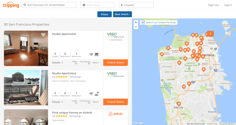
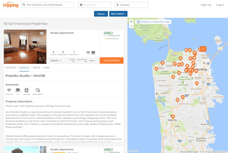
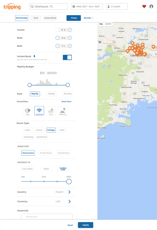
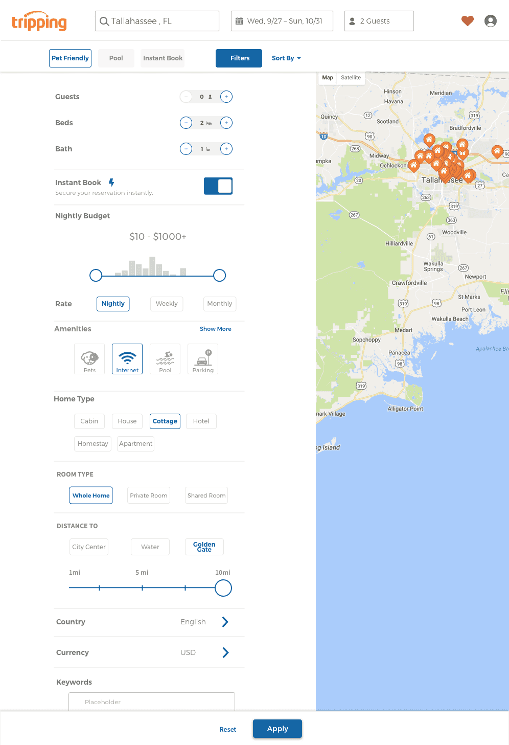
Filters narrow without a wall of options. Price, place, and the one or two amenities that matter sit up front.
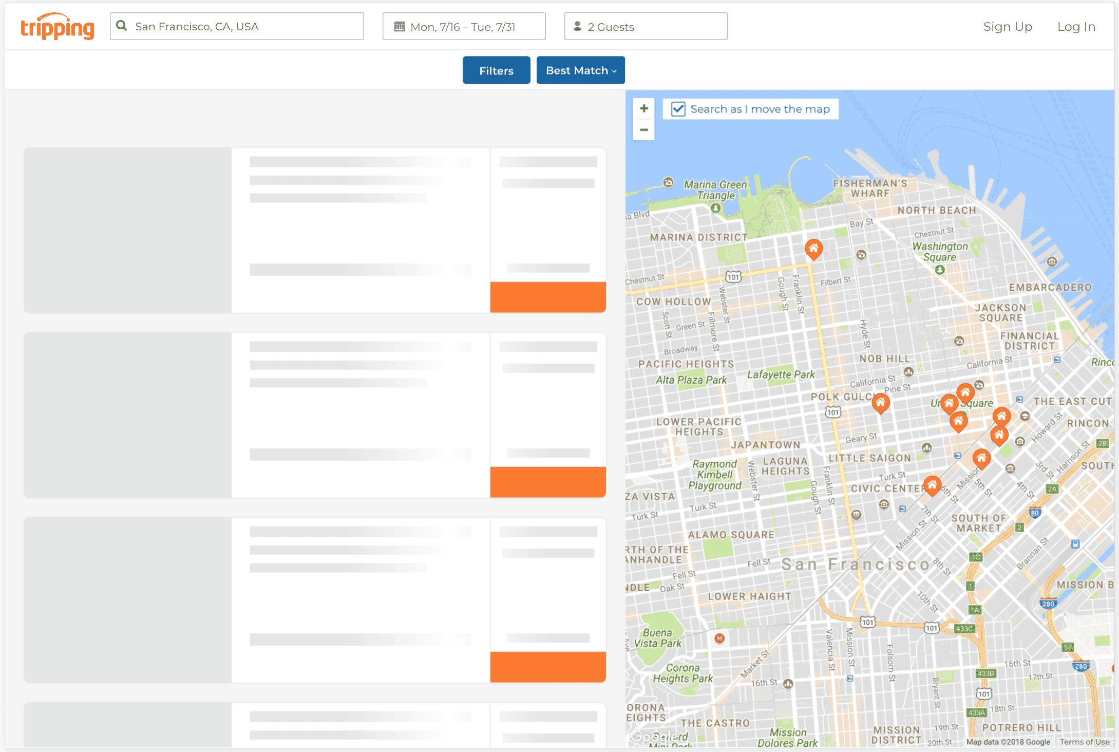
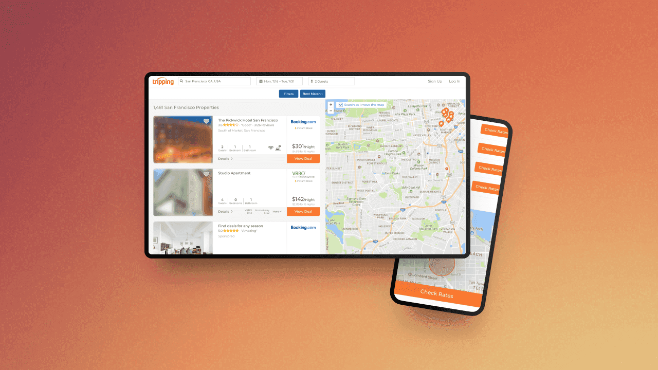
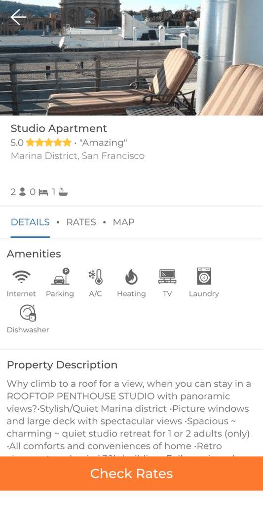
Mobile is for browsing and comparing quickly. Desktop shows more at once.
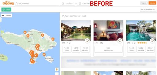
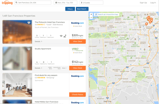
The photo ranking was the part people felt. Same listings, better first impression.
The rest was a cleaner layout so a page full of details didn’t feel like a spreadsheet. People are about to spend real money on a place they haven’t stood in.
Engagement and conversion both moved. I don’t have the exact numbers in front of me anymore, so I’m not going to invent them. The photos did more of that work than the type.
The brief didn’t mention the photos. That’s usually how it goes.